
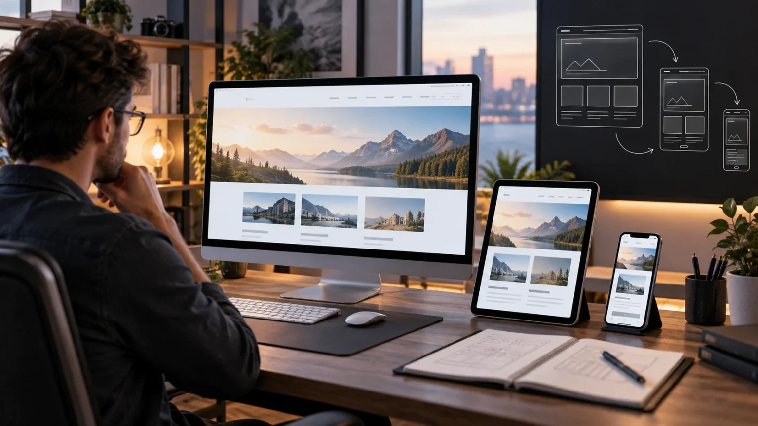

Responsive web design is an approach to building websites that automatically adapt to different screen sizes, devices, and orientations. Instead of creating separate desktop and mobile versions, developers design one flexible layout that adjusts itself based on available space. This helps users browse comfortably whether they visit from a smartphone, tablet, laptop, desktop monitor, or another internet-connected device.
Modern users expect websites to work smoothly across many screen sizes. A page that looks attractive on a large monitor may become difficult to use if text is too small, buttons are hard to tap, or content extends beyond a mobile screen. Responsive design solves these problems by making layouts, images, navigation, and typography more flexible.
Responsive web design has become a fundamental skill for web developers because device sizes continue to vary. It combines flexible layouts, CSS media queries, responsive images, and mobile-friendly design principles to create consistent experiences. Understanding how responsive design works can help you build websites that are easier to use, maintain, and access across modern devices.
What Is Responsive Web Design?
Responsive web design is a development method that allows a website’s layout to change according to the size and characteristics of the user’s screen. Elements may resize, move, stack, or disappear depending on available space. The goal is to maintain readability and usability without forcing visitors to zoom, scroll horizontally, or struggle with poorly positioned controls.
A responsive website uses flexible measurements rather than depending entirely on fixed dimensions. For example, content columns might expand across a desktop screen but stack vertically on a smartphone. Navigation menus may also change into compact mobile menus when there is not enough horizontal space to display every link comfortably.
The design remains part of the same website even though its appearance changes between devices. Developers do not need to maintain completely separate mobile and desktop pages for every piece of content. This approach can simplify development while providing users with an interface that feels appropriate for the device they are using.
Why Responsive Web Design Matters
People browse the web from a wide range of devices, including smartphones, tablets, laptops, televisions, and large desktop monitors. A layout designed for only one screen size may become frustrating or unusable elsewhere. Responsive design gives websites the flexibility needed to support these different environments without creating a separate experience for every device.
Usability is one of the strongest reasons responsive design matters. Mobile visitors should be able to read text, tap buttons, complete forms, and navigate pages without excessive effort. When layouts adapt properly, important content remains visible and interactive elements are positioned in ways that make sense for smaller screens.
Responsive layouts also make websites easier to maintain. Developers can work with one primary codebase and adjust styles based on screen conditions rather than managing multiple versions of the same site. This creates a more consistent development process and reduces the chance that one device version becomes outdated compared with another.
How Responsive Layouts Work
Responsive layouts usually depend on flexible containers that expand or shrink according to available screen width. Instead of setting every section to a fixed number of pixels, developers can use relative units such as percentages, rem, em, or viewport-based measurements. These units allow elements to respond more naturally when the browser window changes size.
Modern CSS layout systems such as Flexbox and CSS Grid make responsive design significantly easier. Flexbox is useful for arranging elements along rows or columns and controlling how they wrap when space becomes limited. Grid provides powerful tools for creating multi-column layouts that can reorganize themselves across different screen sizes.
The key is to design relationships between elements rather than assuming one permanent layout. A three-column desktop section might become two columns on a tablet and one column on a phone. When these transitions are planned carefully, users receive the same content while the visual presentation adjusts to their available space.
What Are CSS Media Queries?
Media queries are CSS rules that apply styles only when certain conditions are met. Developers commonly use them to change layouts based on screen width, although they can also respond to factors such as orientation or user preferences. Media queries make it possible to apply different styling without changing the underlying HTML content.
For example, a desktop navigation bar might display several links horizontally when the screen is wide enough. At smaller widths, a media query can adjust the layout and introduce a compact menu instead. The same technique can change font sizes, spacing, column structures, or the visibility of specific interface elements.
Media queries should be used thoughtfully rather than creating dozens of unnecessary breakpoints. Responsive design works best when layouts naturally adapt between sizes, with media queries handling points where the design genuinely needs to change. This makes CSS easier to maintain and creates smoother transitions between device widths.
Understanding Responsive Breakpoints
Breakpoints are screen widths where a website’s layout changes significantly. Developers may use breakpoints to move navigation, stack columns, resize typography, or adjust spacing when the current design no longer fits comfortably. Breakpoints are commonly implemented through media queries and should be chosen according to content needs rather than specific device names.
It can be tempting to create separate breakpoints for every popular phone, tablet, and laptop, but device sizes change constantly. A better approach is to resize the browser and identify where the layout begins to look crowded or unbalanced. That point becomes a logical place to introduce a responsive adjustment.
Common design systems may use broad categories such as small, medium, large, and extra-large screens, but these categories are not strict rules. What matters most is whether the content remains readable and usable. A responsive website should work between breakpoints as well as at the exact widths developers use during testing.
Mobile-First Responsive Design
Mobile-first design means starting with the smallest practical screen layout and then adding enhancements for larger screens. Instead of building a complex desktop page first and trying to remove features for mobile users, developers begin with essential content and functionality. Larger layouts can then gain additional columns, spacing, or navigation options as screen space increases.
This approach encourages developers to prioritize what users actually need. Small screens force you to think carefully about content hierarchy, button placement, readability, and unnecessary visual elements. Once these essentials work well, creating an expanded desktop experience becomes a process of enhancement rather than repair.
Mobile-first CSS often uses base styles for smaller devices and media queries with minimum-width conditions for larger layouts. This can lead to cleaner styling because the simplest version becomes the default. The approach also supports a broader development mindset focused on accessibility, performance, and progressive enhancement.
Responsive Images and Media
Images can cause major responsive design problems when they use fixed dimensions larger than the available screen. A wide image may overflow a mobile layout and force horizontal scrolling. Developers commonly make images flexible by allowing them to scale within their containers while preserving the correct aspect ratio.
Responsive image techniques can also improve performance. Large desktop images may contain far more data than a small phone actually needs, so developers can provide different image sizes for different situations. Modern HTML features allow browsers to select an appropriate image based on the device and layout requirements.
Videos, maps, embedded content, and other media also need responsive behavior. Their containers should adapt without breaking the surrounding page or creating awkward empty space. Testing media carefully is important because third-party embeds do not always respond automatically in the same way as standard images.
Responsive Typography and Readability
Text should remain easy to read regardless of screen size. Desktop typography that looks balanced may become overwhelming on a small phone, while very small mobile text can become difficult to read. Responsive typography adjusts font size, line height, spacing, and text width to create comfortable reading experiences across devices.
Developers can use relative CSS units to help typography scale more naturally. Units such as rem make it easier to maintain consistent relationships between headings, paragraphs, buttons, and other interface elements. Modern CSS functions can also create flexible font sizes that grow gradually between minimum and maximum values.
Line length deserves attention as well. Extremely wide paragraphs can become tiring to read on large screens, while cramped text blocks create problems on smaller devices. Setting sensible content widths and spacing helps preserve readability, ensuring that responsive design supports both visual appearance and actual reading comfort.
Responsive Navigation and User Experience
Navigation often requires significant changes between desktop and mobile layouts. A desktop header may have enough room for a logo, several menu links, search tools, and account controls. On a narrow mobile screen, placing all those elements in one horizontal row would make the interface crowded and difficult to use.
Responsive navigation can simplify the experience by grouping secondary links or introducing a collapsible menu. Important actions should remain easy to find, and touch targets need enough spacing for users to tap them accurately. Designers should avoid hiding essential navigation so deeply that mobile visitors struggle to understand where to go.
Responsive user experience extends beyond menus. Forms, tables, modal windows, cards, buttons, and interactive components all need to work at different widths. Developers following a broader full-stack roadmap should treat responsive front-end development as an essential part of building complete, user-friendly applications.
Responsive Web Design and Accessibility
Responsive design and accessibility often support similar goals because both aim to make websites usable under different conditions. Flexible layouts help people who zoom browser content, use larger text settings, or interact through devices with limited screen space. A layout that breaks immediately when text becomes larger can create serious accessibility barriers.
Buttons, links, and form controls should remain large enough to interact with comfortably on touchscreens. Developers should also avoid relying entirely on hover interactions because mobile devices may not have a traditional pointer. Keyboard navigation, visible focus indicators, semantic HTML, and readable contrast remain important regardless of screen size.
Testing responsive layouts with accessibility in mind creates stronger websites overall. Resize the browser, zoom the page, increase text size, navigate with a keyboard, and test important interactions on real mobile devices when possible. These checks reveal problems that may not appear when developers only look at screenshots at standard breakpoints.
Common Responsive Web Design Mistakes
One common mistake is designing desktop pages first and treating mobile responsiveness as a final correction. This can lead to crowded layouts, unnecessary elements, and complicated CSS overrides. Thinking about responsive behavior early makes it easier to create components that naturally adapt instead of requiring major changes near the end of development.
Another mistake is relying on fixed widths for containers, images, or interface components. Fixed dimensions can work in controlled situations but become problematic when the screen becomes smaller than expected. Flexible units, maximum widths, wrapping behavior, and responsive layout systems generally create more reliable designs across unpredictable viewport sizes.
Developers may also test only a few popular screen dimensions. A website can look perfect at 375 pixels and 1440 pixels while breaking badly at widths between them. Responsive design should be tested continuously across many sizes because real users can resize windows, rotate devices, zoom pages, and browse from hardware you did not specifically anticipate.
How to Test a Responsive Website
Browser developer tools make responsive testing much easier by allowing you to simulate different viewport sizes. Most modern browsers include device modes where developers can resize pages and inspect mobile layouts quickly. These tools are valuable during development because you can identify overflowing content, broken grids, and poorly sized controls without constantly switching devices.
However, browser simulation should not completely replace testing on real hardware. Physical phones and tablets can reveal differences in touch interaction, browser interfaces, virtual keyboards, orientation changes, and actual performance. Testing important pages on several real devices can uncover usability issues that are difficult to notice on a desktop computer.
Developers should test content rather than only visual dimensions. Check long headings, forms with validation messages, unusually large images, empty states, tables, navigation menus, and dynamic data. Responsive layouts need to survive realistic content because perfectly controlled sample text may hide problems that appear once a website contains real information.
Benefits of Responsive Web Design
One major benefit of responsive design is providing a more consistent experience across devices. Visitors can access the same website and information whether they are browsing on a phone or desktop computer. Layout adjustments preserve usability while avoiding the confusion that can come from significantly different versions of the same website.
Responsive design can also make development and maintenance more efficient. Teams can improve a shared design system rather than maintaining separate desktop and mobile websites. Reusable responsive components create consistency across pages and make it easier to introduce future design changes without rebuilding multiple versions independently.
Another benefit is flexibility for future devices. Developers cannot predict every screen size that will appear over the coming years, but responsive principles reduce dependence on exact hardware specifications. Websites designed around flexible layouts and content-driven breakpoints are better prepared to adapt when new device sizes and browsing environments become common.
Conclusion
Responsive web design is an approach that allows websites to adjust automatically to different screens, orientations, and available space. It combines flexible layouts, responsive images, media queries, typography, and adaptable navigation to create a consistent experience across phones, tablets, laptops, and desktop displays.
Successful responsive design is not simply about shrinking a desktop website. Developers need to consider content hierarchy, readability, touch interaction, accessibility, performance, and how components behave when space changes. Mobile-first thinking and content-based breakpoints can make this process more organized and easier to maintain.
For beginners, responsive design is an essential web development skill rather than an optional extra. Practice by building layouts with Flexbox and Grid, testing across many screen widths, and gradually improving navigation and typography. Once responsive thinking becomes part of your normal development process, building flexible interfaces becomes much more natural.
FAQs
What is responsive web design in simple words?
Responsive web design means creating a website that automatically adjusts its layout and content to fit different screen sizes. It helps the same website work comfortably on phones, tablets, laptops, and desktops.
What are the main elements of responsive web design?
The main elements include flexible layouts, CSS media queries, responsive images, adaptable typography, and mobile-friendly navigation. Together, these techniques allow website content to reorganize itself according to available screen space.
What is a breakpoint in responsive design?
A breakpoint is a screen width where the website layout changes to remain usable. Developers use CSS media queries at breakpoints to adjust columns, navigation, spacing, typography, or other design elements.
Is responsive web design the same as mobile-friendly design?
They are closely related, but responsive design specifically describes layouts that adapt across many screen sizes. A mobile-friendly website may work on phones without necessarily using a fully flexible responsive layout.
Do beginners need to learn responsive web design?
Yes. Responsive design is a fundamental front-end development skill because modern websites must work across many devices. Beginners should learn flexible CSS layouts, media queries, mobile-first design, and responsive testing early.